
In this tutorial you'll learn how to create a security seal using Guilloche, the artistic technique that is typically used in banknote design and other documents to prevent them from being forged.
Background
According to Wikipedia, "Guilloche is a decorative engraving technique in which a very precise intricate repetitive pattern or design is mechanically engraved into an underlying material with fine detail. Specifically, it involves a technique of engine turning, called guilloché in French after the French engineer 'Guillot', who invented a machine 'that could scratch fine patterns and designs on metallic surfaces'. The machine improved upon the more time-consuming practice of making similar designs by hand, allowing for greater delicacy, precision, and closeness of the line, as well as greater speed."
Surely there's a Guilloche design in your everyday life. Bills, checks, ID cards, passports, driver licenses and several documents including academic diplomas or certificates. Any kind of document that requires some complex graphics to avoid being forged, are using Guilloche in some way or another.
This lost art is still kept alive due to the necessity of authenticating a paper that has some value and there are companies dedicated to this job. Securency is a global company specialized in creating designs for banknotes in over 22 countries: securency.com.au/.

Online Guilloche Pattern Generator
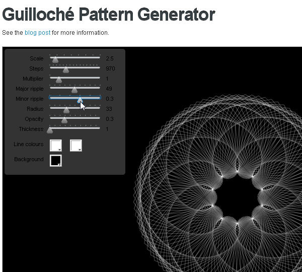
Googling "guilloche" you'll find many images related to this technique, and even some free or pay apps for these creations. Guilloche Pattern Generator allows you to create a guilloche rosette online, but only exports a low-resolution JPG. Anyway it's interesting to spend some time creating different patterns to understand better the technique: subblue.com/projects/guilloche.
Guilloche Software I: Excentro (Mac)
Excentro is Mac OS software for creating all kinds of elements using Guilloche. This app seems to be very complete, but it costs $500, a bit expensive for a tool that we'll use occasionally: excourse.com/excentro/.

Guilloche Software II: GuardSoft Cerberus
Other apps such as Cerberus GuardSoft are specific to companies involved in the creation of banknotes and documents, and in this case the price is not published on its website, but is likely higher than Excentro's: guard-soft.com/cerberus.html.
In our tutorial we'll create a fictitious Security Seal that may be used in diplomas, certificates, or seals for software or an original DVD. Since the amount of patterns that can be made with Illustrator are unlimited, we'll explain only some basic designs for you to know how they can be made and then you can investigate on your own how to create new patterns.

Step 1
One of the most important starting tasks is to create a grid that will help us to draw objects as accurately as possible. The dimensions of the document are important and also the use of guides to mark the exact center of the workspace.
Then we'll create a new 800 by 800 px document. In Edit > Preferences we'll set two things: the measure unit in pixels, and size/color of the Grid. We need a grid of 100 pixels subdivided to 10, obtaining small 10 px squares. Use a not very dark color to help you have the grid always visible without bothering your sight.

Step 2
It's also important that at many steps of our exercise you ask Illustrator to place an object snapped to the grid, or you can hide/show it all the time and the same with the exact center of the document guides. There will be some mechanic tasks that will require extreme precision and that's why we'll use all that help and guidance in our drawing job.

Step 3
In a 800 by 800 px document with a grid of 10px and Guides in the center, we'll draw an oval of 80px width and 200 px height, aligned with our vertical guide and touching the top of the document.
Dragging an object with the grid visible makes it stick to the grid to be finally placed with accuracy. This oval has no fill color, just a stroke of 0.25 points and a Black color at 80%.

Step 4
In the exact middle point (we hide our guides so you can see better) draw a cross that will help you turn the oval using the document axis.

Step 5
While pressing Alt + Shift, drag the oval to the opposite side. The Alt key will duplicate the original object and Shift moves it through a straight line.

Step 6
We group both ovals with the cross and double-click on the Rotate tool, which will open its options window. We'll rotate our group 2 degrees making a copy and leaving the original where it is.

Step 7
A keyboard shortcut that we'll use often in this tut is Command + D. Once we rotate a copy of our group, press Command + D to create more copies with the same rotation angle. Will start to see what was the purpose of this group of items as we keep pressing Command + D.

Step 8
We took a full turn of 360° rotating 2 ovals and this is the first outcome of our tutorial, a basic Gulloche rosette pattern. We remove all the crosses as we only used them to help us with the group duplication. Delete all of them using the Group Selection Tool.

Step 9
We need our pattern not to look so basic so we'll remove some of the ovals. Double-clicking on our first oval will select the opposite one. Delete the group.

Step 10
Going clockwise you must delete 1 group of ovals and leave the following 6. This action will make equal blank spaces across the pattern.

Step 11
This is the final look of this task. Now our pattern isn't basic and it looks a bit elaborate. We shall see later whether to modify the stroke weight, but first let's get all the necessary elements for a later edition once we have it all.

Step 12
In a new layer we'll cover a large part of the rosette with a 740 px circle, filled with a white color, and using the same stroke of 0.25 pt and black color at 80%.

Step 13
Now create a copy that is 97% smaller by selecting the circle and double-clicking on the Scale tool. Again we'll make a copy to preserve the original object.

Step 14
Go to Window > Pathfinder, and while selecting both circles we'll choose Divide. This action cuts both circles into two different objects.

Step 15
We'll separate this group with Object > Ungroup, then select the outer ring you will cut and paste it into a new layer, thus leaving the other circle in a layer below it.

Step 16
Between the ring and the circle we'll repeat the task of creating a rosette, this time smaller and thinner than before. Then repeat the previous steps of duplicating this new oval and draw a cross for reference.

Step 17
Since our ovals are narrower, this time the pattern will be tighter. With Command + D, repeat the rotation of 2 degrees as we did before to complete the whole 360° rotation.

Step 18
Taking a look to what we have drawn so far, we'll notice that it's giving us some cool results. At this point we have a typical guilloche style pattern, but we'll continue to create more complex forms in this exercise.

Step 19
Let's draw a 36 points star. Select the Star tool, click on the exact center of the document, and then fill the options with these sizes and amount of points.

Step 20
We'll round the star corners in Effect > Stylize > Round Corners.

Step 21
Use a radius of 20 pixels in the options box.

Step 22
Illustrator creates Appearances on objects, giving another look to an objet without destroying the original. So you'll see that the star still has its points, but they look curved. In the next steps we will remove that appearance, but for now we'll continue this way. What we have to do now is make a copy of our star, but 50% smaller. With the star selected double-click on the Rotate tool to enter these values.

Step 23
Now we work with the Blend Tool. Select both stars and then click on an edge of the bigger star.

Step 24
Clicking on the same tip of the smaller star we'll see the mixing effects between two objects. We will modify that.

Step 25
Double-clicking on the Blend tool will show its options. We need 30 steps of blending.

Step 26
We get another classic Guilloche pattern: the Oyster. To hide the outer edge of this pattern we'll create a solid stroke above it.

Step 27
Select both stars and go to Object > Expand Appearance. Now we can copy and paste the bigger star in a new layer.

Step 28
There we will apply a 9 points stroke on our new star, and will convert this line into curves by going to Object > Path > Outline Stroke.

Step 29
With the Eyedropper Tool we can click on another element of the tut and give the same values to the new one. First select it and then choose another item to obtain the same appearance.

Step 30
Now let's draw a line around this star we've got. Using the Line Segment tool we will create a vertical line at the exact middle of the file. Hide the central guides by going to View > Guides > Hide Guides for a better view.

Step 31
Since the star had 36 points, we'll repeatedly copy this line until you get 36 lines rotated 10°, each to complete the whole 360°.

Step 32
Remember that we can also use Command + D here to duplicate the turned line. You will see that these new lines match with the curved edge of the star.

Step 33
Now we group these lines by selecting them and pressing Command + G or by going to Object > Group. And again we'll make a copy of this group, but only using 5° of rotation.

Step 34
This has filled the spaces between lines with other lines. We'll reduce them a bit to match the stroke of the star without exceeding that area.

Step 35
Now we'll select the first set of matching lines with the star edges. Now change the stroke color to black and increase the weight to 3 points.

Step 36
Finally, we'll make a copy of the smaller star placed in some layer below. We'll paste it over all and we'll rotate this new element 5° matching the star edges with the dark strokes created before.

Step 37
In a new layer we'll create a 200 px circle with black color at 80%. With the Ellipse tool, click on the document and write these values in its window. Then place the circle in the exact center.

Step 38
Now we'll use a very interesting tool of Illustrator: Scribble. Go to Effect > Stylize > Scribble with our circle selected.

Step 39
In the Scribble Options dialog box enter these values. This action creates symmetrical curves within the circle using its fill color to draw some lines with an ornamental look.

Step 40
With simple steps we get a spherical shape made of moire lines. Using other figures and playing with parameters, you'll find interesting uses of the Scribble tool in the Guilloche style.

Step 41
Now create a 660 px circle with the Ellipse Tool. Select that tool and click on the workspace to open its window and enter the exact value. Once you've drawn this circle, you can accurately center it with a simple trick: pressing Command + 1 will exactly center your screen. Then select your circle, press Command + X (Cut), then Command + V (Paste), and Illustrator will place the object perfectly centered into your document.

Step 42
We'll increase the circle stroke to 80 points using the same color all over the work, with 80% black.

Step 43
Now let's draw a new circle where you'll apply a text that surrounds the previous circle. We repeat the above steps, but this time draw a 645 px circle.

Step 44
Choose the Type on a Path Tool and click on the top point of the circle. This makes a text field so we can start writing.

Step 45
Using the Times New Roman Bold font at 21 point size, start to write the text and then select it with the Type tool in regular version. Then press Command + C one time and Command + V several times to duplicate it.

Step 46
To approximate the distance between first and last copied text, we'll increase text tracking to 33. The tracking value will depend on the text you type, and our purpose is to create a continuous text as united as possible from beginning to end.

Step 47
Be sure to use a new layer for each object that we created because that helps to edit the file later. Now create a "V" using Times New Roman Bold at 450 pt. Try to align this letter leaving 2 large areas on its bottom sides to enter additional text. Then convert it into outlines by applying Type > Create Outlines.

Step 48
Then we'll create a wave pattern to fill our V. Select the Line Segment tool in the toolbar and click on the screen to open the editing window, entering these values. Apply to this line 0.25 pt weight and 80% black. Then select it and press Shift + Alt, then drag a few pixels down. Now duplicate this action with Command + D to create a straight lines pattern.

Step 49
Select all lines and go to Effect > Distort & Transform > Zig Zag. In that window, enter these parameters and press OK.

Step 50
We'll use our V to mask this pattern. Copy the V we made earlier and paste it into the lines pattern layer. To create a mask with this vector always place it above the object to mask, and remove any fill or stroke leaving this vector completely transparent. Select the pattern and the V and go to Object > Clipping Mask > Make or press Command + 7.

Step 51
In order to properly show the pattern on the V we should change its color to white. To select objects within a mask you can use the Group Selection Tool.

Step 52
Let's create another pattern for the filling of our V. Draw a circle at 280 pixels, align it with the vertical guide and 60 pixels away from the top of our document.

Step 53
Choose the Rotate Tool and click on the lowest point of the circle. Your cursor will change from a cross to a black arrow, taking that point as the rotation axis. Now press the Alt key and you'll see how the cursor changes to a double arrow, indicating that the object will be duplicated. With the Info window open, make sure to rotate the copied object as close as possible to 6°.

Step 54
With Command + D you will repeat this action to complete a 360° rotation.

Step 55
This is the result of what we just did, a new rosette pattern normally used in Guilloche designs. We'll also change the stroke color to white.

Step 56
Increase the thickness of the strokes to 0.5 points to get a better contrast from the wave lines pattern. We'll mask our rosette in the same way as we did with the previous pattern, and make sure to place the rosette center in a non-visible area inside the mask, because at that spot there is a lot of lines, and it won't look good inside our V.

Step 57
Zooming in with Command + we can appreciate the details in our V. This combination of patterns is used very often in Guilloche style work.

Step 58
In a new layer we'll copy and paste our V again to create a stroke around it. Select and go to Object > Path > Offset Path and enter these parameters in the editing window:
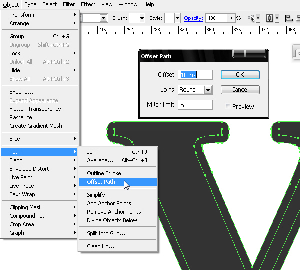
Step 59
Offset Path creates another object behind the original, grouping both. We'll use just the outer stroke so we must split these vectors. To ungroup them, go to Window > Pathfinder and choose the Divide option. This cuts both objects separately and we can remove the inner vector to preserve the other.

Step 60
With Alt + Shift we'll create a copy upward to the left top to create a 3D extrusion. Then fill it with white and black at 80% color stroke with 0.25 pt weight.

Step 61
Now we finish our label edition by adding a gradient in the outer morphed star behind the V. Since these are 2 objects joined with the Blend Tool, what we do with the outer shape will affect the morph with the inner shape. So let's fill the big star with 20% black and white 0.5 pt stroke. We'll also change the small star's stroke with the same values as the big one, but keeping its white color fill.

Step 62
Let's edit a final text in our seal, drawing a 300 px circle centered on our document.

Step 63
Previously you must download and install this font in your OS: dafont.com/united-states.font. It's a similar font to the one used in dollar bills.

Step 64
Select Type on a Path Tool and click on the top of the circle, then begin to write using our new font at 21 pt, always using black 80%.

Step 65
Selecting this new text path, click on the tool and this will open its window where you'll choose these options. By selecting the Flip option our text will use the inner side of the path.

Step 66
With the Selection Tool you can drag that little line at the beginning of the text. That will allow you to move the text within the path to your desired position.

Step 67
Since we want this text not to be overlapped with the V letter, we'll add some blank space typing with the space bar.

Step 68
If for some reason your text doesn't fill the whole path, you can edit the text tracking for better results. In this case the text exceeds the space and we had to reduce the tracking in order not to touch the V.

Step 69
Once we finish, we'll add a Drop Shadow on the text. Go to Effect > Stylize > Drop Shadow.

Step 70
We'll reduce the blur to zero because smooth shadows aren't a style used in Guilloche. Enter the other parameters of this capture and press OK:

Conclusion
Finally, we've got a realistic Guilloche seal working with Illustrator and certain precision tricks used in this style. Now that you've learned some techniques, you can observe Guilloche designs and try to replicate those that inspire you later with vectors.
Black at 80% gives a smooth look to the seal and brings better integration between shapes. You should try to paint each layer with a different color, because a multicolor guilloche seal is also helpful for counterfeiting prevention due to the prints complexity.
Don't forget to play around with Copy + Rotate in simple shapes to create new rosettes and know all the creative possibilities of the Blend Tool, Moire Scribble, Wave Patterns and Shapes with Rounded Corners, like the stars we drew.
You can view the final image below or view a larger version here.


No comments:
Post a Comment